Why Your Labels Don’t Match: Understanding Digital Label Printing Platforms and Color Matching Challenges
In the world of custom labels, color consistency is everything, especially for brands that rely on their visual identity to stand out. But as digital label printing becomes more accessible and diverse, many customers are finding out the hard way that not all digital print platforms are created equal. A recent project shared by one of our experienced sales reps highlights a common (and frustrating) scenario that can occur when expectations around color matching aren’t properly aligned from the start.
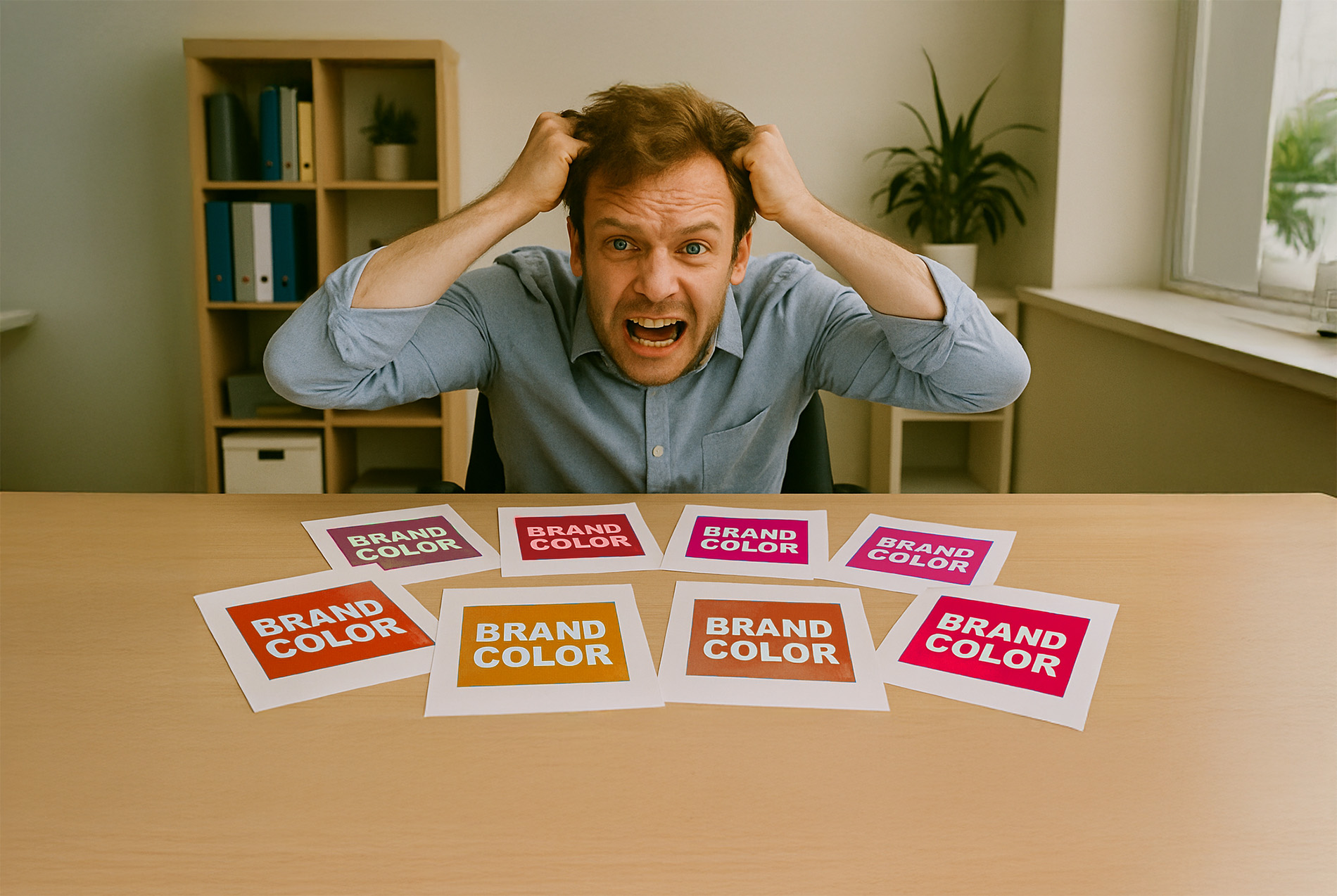
A Real-World Example: When Matching Goes Wrong
One of our partners recently struggled to get a digital label project approved by a customer who was adamant about matching specific PMS (Pantone Matching System) colors. Despite multiple rounds of test prints, the customer kept rejecting the samples, claiming the colors didn’t “match.” Eventually, we tracked down a sample of their existing labels, originally printed by a different vendor and the root of the problem became clear: the previous version didn’t accurately match the PMS colors either.
In other words, the customer had grown accustomed to an inaccurate version of their brand colors and expected us to reproduce that instead of the actual PMS values. This is a classic example of color misalignment caused by differences in digital printing platforms.
The Digital Printing Landscape: Not One-Size-Fits-All
Digital label printing is not a singular process. There are various platforms and print engines on the market, each with different capabilities when it comes to color:
- 4-color (CMYK) engines: These use cyan, magenta, yellow, and black inks to create a wide range of colors. They’re great for full-color images but can struggle with precise PMS color reproduction.
- 5 to 7-color engines: These platforms may add colors like orange, green, or violet to expand the color gamut and improve accuracy for spot colors. This makes them more capable of hitting tough brand colors, but they still may not match exactly without proper setup.
- Digital white and varnish options: These are also available on some machines, and they can further affect how colors appear depending on the face stock.
The Role of Substrate (Face Stock) in Color Perception
Another often-overlooked factor in digital printing is the material itself. The same CMYK file printed on glossy white paper will look dramatically different when printed on kraft, clear film, or metallic materials. Paper absorbs ink differently than film. Coated stocks reflect light differently than uncoated ones. These variations can create what appear to be color mismatches, even if the ink formulation hasn’t changed.
Why Color Matching Is Harder Than It Looks
True PMS color matching on digital presses is a technical challenge. Unlike traditional flexographic printing, which can use actual PMS spot inks, digital presses typically simulate PMS colors using combinations of CMYK (and sometimes additional colors). This simulation is subject to the limitations of the press and software being used, the substrate, and even the environmental conditions in the press room.
Professionals use tools like Delta E to measure how close a printed color is to its target. A Delta E of 1 is nearly imperceptible to the human eye; above 5, most people can notice a difference. But in many cases, customers don’t have a calibrated standard to compare against, they only know what they’ve seen before, whether it’s accurate or not.
One of the smartest things you can do when starting a new label project is to request printed samples, especially if color accuracy is critical to your brand. Samples give you the opportunity to see how your artwork, materials, and PMS colors will actually look on the finished label. While there’s often a small charge for this step, it can save significant time, frustration, and cost in the long run by ensuring everyone is aligned before production begins.
In fact, we encourage our customers to view samples not as an extra expense, but as a strategic investment. It’s one of the most effective ways to set realistic expectations and avoid misunderstandings, particularly when transitioning from one print vendor to another or trying out a new material or print engine.
Setting the Right Expectations
The takeaway? Education is key. Customers moving between different digital platforms or scaling up from an online or entry-level provider need to understand that:
- Different digital presses have different color capabilities.
- Substrates impact color appearance.
- A print that looks “right” on one machine might not look the same on another.
- Accurate PMS matching may require additional setup.
In the case of our sales rep, they ultimately recommended the customer continue with their previous vendor if that output was what they preferred. It was an honest, customer-first approach that also preserved the opportunity for future projects when expectations are better aligned.
How ID Images Can Help
At ID Images, we understand these challenges because we live and breathe label printing every day. With digital capabilities in 7 of our 16 manufacturing facilities across North America, we offer one of the most robust digital label footprints in the industry. Our fleet of high-end digital presses, ranging from 4 to 7-color engines with white ink, varnish, and finishing options allows us to print with precision across a wide range of materials and applications.
Our facilities are backed by industry certifications and a quality assurance process that includes expert-level prepress teams, color management specialists, and real-time color evaluation tools. Whether you need help interpreting PMS colors, understanding substrate behavior, or achieving consistency across reorders, we’re here to guide you through the process.
And because of our nationwide reach, we can support fast turnarounds, cost-effective shipping, and consistent results across multiple locations and product lines.
Final Thoughts
At ID Images, we don’t just print labels, we help brands make informed, confident decisions about how their labels are produced. If you’ve been frustrated by inconsistent colors or unexpected results with digital label printing, let’s talk. We’re ready to help you create labels that meet your expectations every time.